Carolingian Manuscript Art: making an illuminated letter in a Spanish Carolingian style as a special commission
- Laura

- Oct 3, 2024
- 4 min read
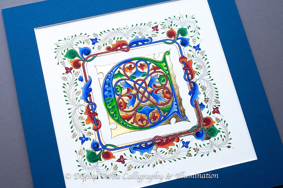
A letter created in the style of the Ripoll Bible, a manuscript from the early 11th century that is considered one of the great works of Spanish illumination and calligraphy
I love it when a client contacts me with a very specific and very informed request. In this case, the request was: can you make an illuminated letter M in the style of the Ripoll Bible, her husband's favorite manuscript. Not being familiar with that particular bible, I looked it up before I replied. My immediate thought was, 'Oh, that seems very Carolingian.' My second thought was, 'But isn't the 11th century late for Carolingian?' And then I wrote the client back and accepted the commission. After a quick back-and-forth email, we settled on a size and materials: 9x6 inches on vellum and some 24k gold leaf. The original Ripoll has no gold, but the client wanted a little sparkle.

Want to know more about Ripoll and Carolingian manuscripts? Then, read on. If not, skip down.
The current town of Ripoll, in Catalonia, Spain is quite small, but it was an important center during the Middle Ages. The area came under Muslim rule as part of al-Andalus after the Arab conquest of the Iberian Peninsula in the 8th Century, but was brought back under Christian control as part of the Marca Hispanica in the 9th Century, a buffer zone established by the Frankish kings of the Carolingian Empire to protect Western Europe from Muslim invasion. All of which is to explain why Carolingian style manuscripts were being produced in parts of Spain while much of the rest of the Iberian Peninsula was being influenced by North African artistic traditions.
Carolingian manuscripts are fairly easy to identify. They are marked by calligraphy done in the very characteristic Carolingian Miniscule, a nicely legible style that became the standard hand of the Carolingian Empire as part of the flourishing of both Frankish art and bureaucracy. The hand also became inspiration for Renaissance scribes and, ultimately, some of the fonts we still use today. The decorative initials of Carolingian manuscripts are equally recognizable, being characterized by fairly simple color palettes and Insular (think Celtic-looking) knotwork with the inclusion of some zoomorphs (animal shapes). The books coming out of the royal scriptoria or that were intended for royal use were sometimes heavily gilded. On the other hand, non-royal books often had no gold at all.
The Ripoll Bible has no gilding, which, technically, means it's not an illuminated bible at all. It was made in the monastery of Ripoll under the auspices of Bishop Oliba. It was copied out in one, single hand by a monk named Guifré. It was then richly and exuberantly decorated and illustrated mostly by another, unfortunately unknown, monk who was aided by a third man who is considered a lesser artist. It does have some Romanesque touches in places, but because Christian Spain was on the fringes of Europe, this book does not show the clear Romanesque style typical of the other 11th Century illuminated manuscripts. If you'd like to see the complete original, it is currently housed in the Vatican Archive https://digi.vatlib.it/view/MSS_Vat.lat.5729.

Unfortunately for me, the Ripoll Bible contains no decorated M's. Neither does it's sister manuscript, the Rodes Bible, which is thought to have been partially completed at around the same time and place before being sent off to another monastery in Catalonia. This one is housed in multiple volumes at the Bibliotheque Nationale de France. And there's no M either in the third Spanish Carolingian manuscript that I consulted, Latin MS 89, a book made in Burgos in the 10th Century and housed at the library of the University of Manchester. Nonetheless, between the three of them, I was able to construct my own M in a similar style.
If your design is symmetrical and you have access to a scanner and some editing software, only draw half of it. I cannot recommend this method enough. It has saved me so much time and so many headaches. I have another method for replicating just small, symmetrical elements that I will post about at another time.
I transfered the final design to my 9x6 inch piece of calfskin vellum (calf or deer). There are very few contemporary sources of quality vellum and parchment (goat or sheep), especially in the United States, but a relatively new producer called Pergamena is now making some very nice stuff. It's not cheap, but quality vellum and parchment shouldn't be, and you can buy it already prepared for use.
After that, it was time to gild and paint. I gilded with 24k gold leaf on a base of gum amoniac. As I said before, the original Ripoll Bible wasn't gilded, but the client wanted a little bling. I added only small amounts and flat-gilded, which was more period-appropriate. Then I painted in a simple, Ripoll-like color palette with gouache. The line-work was done with a walnut ink.
I admit that Carolingian letters like the ones from the Ripoll Bible don't personally call to me. I didn't intend to include anything like it in my Illuminated Letters Alphabet Project, but I'm glad that I got this chance to make one. I enjoyed making it more than I thought I would, which is why I'm always glad when a client challenges me to step out of my comfort zone.


Comments