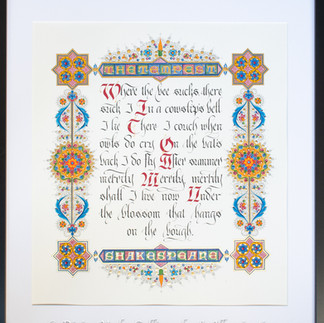
When I was asked to create two illuminated manuscript pieces for a group art show in NYC, I had a much harder time figuring out what to do with my second quote, an excerpt from Shakespeare's The Tempest. With the first one, a quote from Chekov, I was able to envision what I wanted to do much faster. This one, though, took me some time. In the end, I decided to do something very different from the Romanesque style I chose for the partner piece. I went south geographically, to Italy, and about two hundred years later, into the Renaissance. I chose as my stylistic inspiration the Bible of Borso d'Este, which is widely considered one of the masterpieces of Italian Renaissance manuscript art and the very height of Ferrarese miniature painting. It took several artists six years to make the two volume bible for the First Duke of Ferrara, who was in something of a competition with the Medicis for prestige and power. There are other manuscripts that were made in this style (which is easily recognizable), but none so magnificent.
Once I decided on the style of the decorative border, I turned to the style of the text itself. My initial thought was to use the same hand from the Borso d'Este itself. It is an Italianate Rotunda, which is one of my favorites. However, the text in the original is done quite small and when I scaled up, Rotunda just didn't have the oomph I needed to hold its own against what I planned for the border. I needed something showier. Hands from the Italian Renaissance don't tend to be showy, so I decided to go north and used Fraktur, a hand from the German Renaissance. Next up, designing the border.
The Borso d'Este Bible is a riot of bright colors and tiny details, all encased in a swirl of fine lines and embellishments. Just designing the border might have taken me days and days if not for my decision to make the entire thing essentially symmetrical. Why is that important? Because by making it symmetrical, I only had to design a quarter of the piece and, then, through the magic of Photoshop, complete it.


I don't have a printer large enough for the whole design, so I printed it out in pieces on tracing paper and put the whole thing together like a puzzle. After that, I turned my attention back to the text and used the original version of cut-and-paste to get all my lines justified.

Now I could begin the final piece. The first step in this is always to write out the text. This way, if you mess up a word or two, you don't need to remake the entire thing. And, yes, I did make that mistake once and made myself hoarse with all the cursing that ensued.

Once the text was finished, I transferred the design for the decorative border. When using a heavy paper like this one, a light-table won't work. Instead, I used transfer paper (think carbon paper), which is placed under the design you want to transfer. Because the design was so detailed, it took an entire day just to get it all onto the final piece.

And then the real work began, so to speak. First up, gilding. Always gild before painting to prevent the gold from sticking to places you don't want it to. Gold leaf, especially 24k, is like a teenager. It does the opposite of whatever you want it to do. I gilded the thin border areas with Ormoline, a modern size (glue) that goes on very thin and so is easy to make fine lines with.

I gilded the round, floral-like elements along the sides with gum arabic so as to create something of a contrast in textures with the Ormoline lines. The gazillion little dots and the letters themselves were done with historical raised gesso, which protrude slightly off the page to create yet another contrast. Look for the pink bits in the next image. Those are areas of gesso that have not been gilded yet. Both gum arabic and gesso require many layers of gold leaf to look right, many more than any modern gilding product.

Now I could begin to paint. Unfortunately, yet again, I neglected to take more in-process photographs. One of these days, I will remember to actually document the entire process from start to finish. The trouble is, once I get really in a groove, I tend to forget about everything else. So, voila, here is the finished piece in all its garish splendor. Framed, it measures 21 by 23 inches. Look for my foot in the pictures below to get an idea of scale.


Commentaires